A flexible logo family
A character-led display mark, a compact italic wordmark, and a stacked palm symbol give the identity different ways to show up without losing recognition.
A complete visual direction for an Etsy shop, built to feel nostalgic and beachy without slipping into generic coastal branding.
Palm Coast Co. is an Etsy shop Tide worked with to create a visual identity that could carry a growing collection of products while still feeling personal, playful, and easy to recognize.
The system balances warm nostalgia with clearer structure. Expressive type and loose coastal graphics create the personality, while the supporting typeface, strong palette, and alternate marks make the brand practical to use across listings, packaging, social content, and future product extensions.
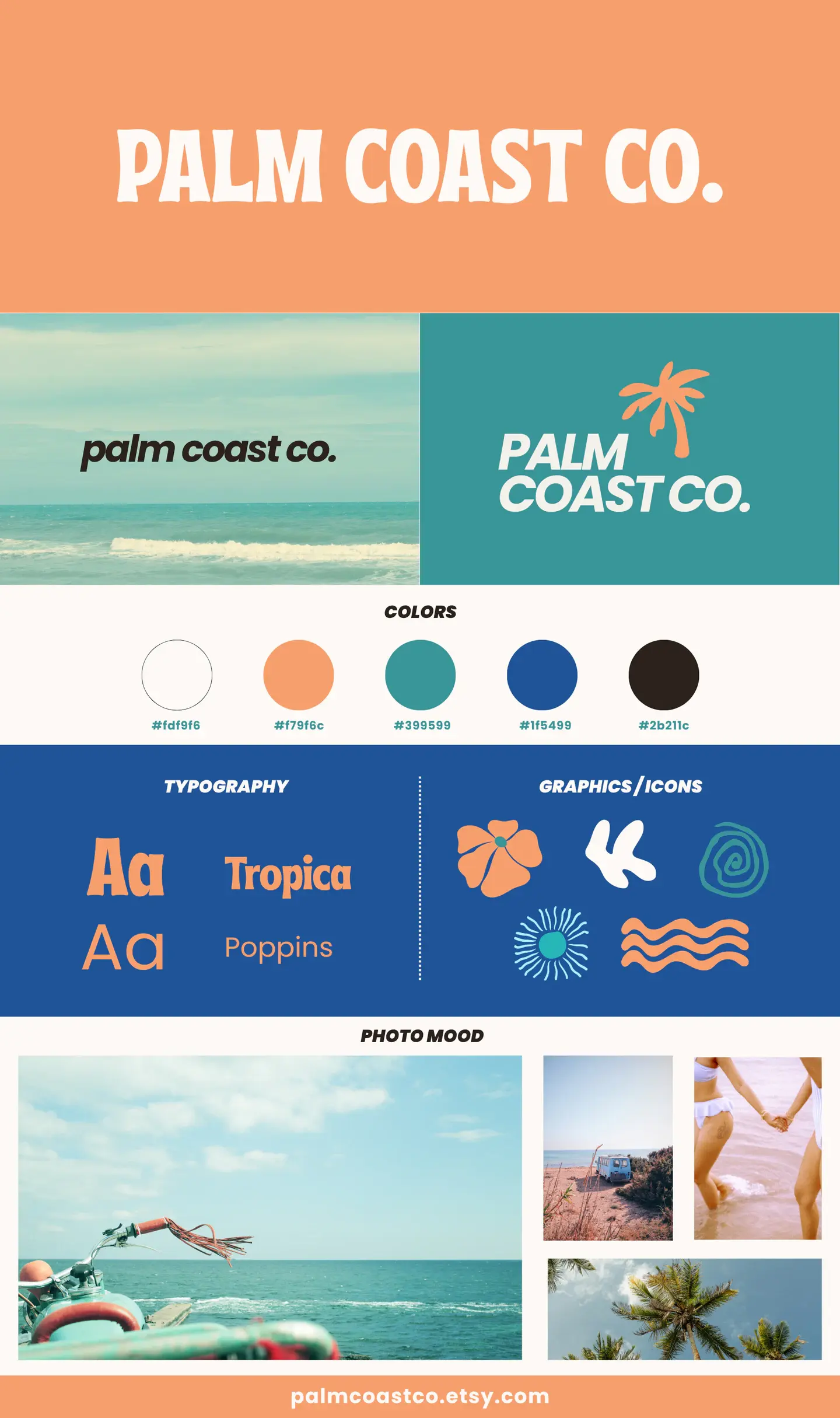
The identity is expressive, but it isn't random. Each layer helps Palm Coast Co. stay recognizable as the product mix and content change.
A character-led display mark, a compact italic wordmark, and a stacked palm symbol give the identity different ways to show up without losing recognition.
Sun-washed orange and off-white keep the brand relaxed and tactile, while teal and deep blue add enough contrast to keep it from feeling overly soft.
Tropica brings the personality. Poppins handles the quieter information, giving expressive headlines a practical supporting system.
Loose flowers, waves, palms, sunbursts, and hand-drawn forms create a visual kit that feels collected over time rather than mechanically matched.
Tide built Palm Coast Co. a flexible visual foundation with enough personality to be memorable and enough range to work across Etsy listings, social content, packaging, and future product collections.
Bring us what feels generic, inconsistent, or stuck. We'll shape a visual system that looks distinctive and still works in the real world.
Start a brand project